Tuesday, 17 November 2009
Unbalanced
This weeks illustration friday topic was 'Unbalanced'.
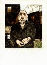
I went with the first thing that came to mind just so I could fit in the bowerbirds again. I'm really enjoying just painting and adding in detail later, losing obvious outlines. My only problem is being able to do it on a dark background. I'd like to be able to have the crispness and contrast of something like this -
But I fear he uses more than watercolours.
Subscribe to:
Post Comments (Atom)


5 comments:
the warm colors and the perspective are just lovely—the light background works nicely!
What a twist to the generic see-saw! I love the simple form of the birds!
Love the colours and the concept!
Sam, your work is very cool! I like these birds and really liked the original post about them..very interesting birds. Great cover art, too!
Very artistic and nicely done! I think you've chosen the right set of colors for this ^__^
Post a Comment